Beginning in September, we began to roll out the new brand and positioning of Illumine8 to better express our company, clients, and passion for the work we do. Over the last six years, our industry has changed. Over 50 percent of our clients trust our expertise not just with their marketing strategy, but also with their sales and customer experiences. These services didn’t exist at our firm three years ago.
When we decided to review our own visual identity, we also did some soul-searching. We discovered that our company has evolved to focus on and serve family-owned businesses. This wasn't a positioning we sought out, rather it has emerged organically. We have found that when working with family-owned-and-operated businesses our mission and passions align. The convergence of our expertise and the values of a family-owned business deliver game-changing results for our clients.
Our passion for strategic marketing, sales enablement, and delivering outstanding customer experiences on behalf of the brands that we serve has not changed. Our developed expertise understanding the intricacies of family-owned-and-operated businesses allows us to make strategic recommendations to our clients that create lasting value. Our new branding and positioning is a commitment to that expertise for our clients.
“We are extremely excited to share our new visual identity and brand positioning,” says CEO Christina May. “Not only do we think that it's beautiful, but this branding isn't just skin deep. Illumine8’s new brand allows us to deepen our commitment to family-based businesses and provides us new avenues to share our insights in marketing, sales, and customer experience.”
The rebranding includes new visual elements including a new logo, logomark, fonts, and color palette. Illumine8 adopted a dark blue as its primary branding color while retaining its original yellow as a complementary color in the palette, symbolizing a nod to the company's original mission of elevating brands into a spotlight.
Our new brand symbolizes and visually connects Illumine8 to the community, its clients, and candidates that join our firm. Each element was intentionally created to symbolize and communicate our values and mission through content.
Logo
![]() Our new logo represents our honest, straightforward brand positioning. It’s simple, smart, and insightful. The capitalized serifed characters represent the strength of our expertise, while the reversed-white space “8” embraces our creative side in a measured tone. There are no frivolous caricatures or garish iconography.
Our new logo represents our honest, straightforward brand positioning. It’s simple, smart, and insightful. The capitalized serifed characters represent the strength of our expertise, while the reversed-white space “8” embraces our creative side in a measured tone. There are no frivolous caricatures or garish iconography.
Typeface
 PT Serif is an open-source typeface designed by Alexandra Korolkova, Olga Umpeleva, and Vladimir Yefimov. We believe the bold weight of this typeface is the perfect choice for our headlines and editorial content. It’s authoritative without being pretentious or overbearing.
Logomark
 A nod to our heritage, our new logomark visually represents our founding tagline — “brand in the dark, step into the light” — in a new way. Shortening the representation of Illumine8 to “i8” refines the look to our forward-looking connectivity mark.
Connectivity Mark
 A symbol of our values. This mark symbolizes the multi-faceted connections in our work. Highly complex, this series of dots and lines visually represent the relationships between data, ideas, creative, communities, and legacies. Unlike our logo and logomark, there is no singularly defined mesh. It is ever-evolving and can exist in many visual forms.
Photography
 Illumine8's photography focuses on intentional elements that provide visual clarity to branded content by utilizing high-contrast, balanced imagery. The emphasis lies on substance over style.
Color
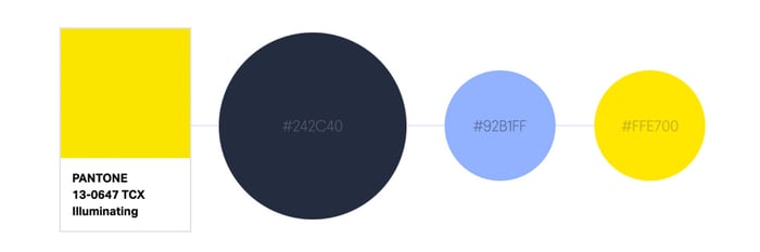
Proven as the strongest hue for associations with trust and professionalism, blue emerged as the obvious primary color for Illumine8’s rebrand. The deep, mildly saturated dark blue hue contrasts firmly on white backgrounds and offers the same visual clarity as a background for our "Illuminating" accent yellow. Our brighter blue hue acts as a versatile, secondary complement in either instance.
Content

Our rebrand not only focuses on visual aesthetics, but also on the positioning of delivering value through communication. Featured insights are at the forefront of our rebranding. Delivering value first through our expertise.