The real estate industry has deep roots in marketing and utilizing the art of word and image. The marketing or consumption of marketing of a property is a daily task to get eyeballs on your client's listing or keep positive relationships with your other agents.
The National Association of REALTORS® reports that more than 156,000 Americans received a new real estate license in 2020 and 2021, pushing the total number of real estate agents in the U.S. to a record. As housing inventory has gradually slowed in this competitive market, differentiating your real estate firm is more important than ever.
The speed at which residential properties are posted and sold leaves little room for a robust campaign that involves months of planning. Properties must be posted fast, often, and in various mediums - with website optimization. Today's residential and commercial real estate brokers have become online content gurus with drone videos, production-heavy home tours, individual agent websites, and blogs.
With the ability to make web content through design platforms like Canva and a plethora of web-friendly google fonts now available at your fingertips, your real estate company has access like never before to create branded web content and utilize web optimization tools.
Agents are creating their websites and personal online marketing channels outside their brokerage in self-publishing platforms to set themselves apart and have a quicker turnaround for posting. This may tempt one to get "creative" with their website font choices. "With great power comes great responsibility,"- so just be sure to avoid these seven worst fonts from our definitive list.
7. Times New Roman
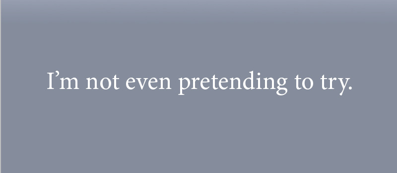 Let’s get this one out of the way. In a parallel universe where the decades-long default font is Garamond, Times New Roman is a lovely serif font. But we don’t live in that universe.
Times New Roman has one thing going for it as a body font: People are used to reading it since they’ve been seeing it as a default font in word processing programs - this also makes it incredibly dull. Times New Roman is also inappropriate for a website as it was designed for print in small sizes and columns (aka newspapers). Finally, like most other serif fonts, Times New Roman is difficult to read on screens.
6. Lucida Calligraphy
Nothing says "I'm out of touch" more than a "handwriting" font on a website. While it's true that a typeface can help evoke emotion, in this case, Lucida Calligraphy has no business nor alludes to a positive or professional vibe for your real estate website.
Lucina Sans will have your website bounce rate through the roof as it is extremely dated and shows poor effort in an attempt for variety and subtext.
5. Verdana

Do you know how I know Verdana is terrible? It was a good font choice in 2002. And believe me; I made no good style decisions in 2002. This font’s entire existence is built on the fact that it’s a web-safe font that’s not Arial. What kind of resume is that?
The Verdana font was one of the earliest fonts designed for screen reading. We've come a long way since then, and your real estate firm's website will look dated and basic.
(Honorable Mention: Tahoma)
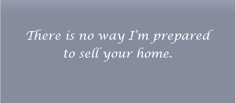
4. Brush Script

People are entrusting you with the most significant investment of their lives. This font evokes the opposite of what I would want in a Real Estate Broker. To be blunt - It’s cheap and rude. Somewhere in the world, there is a bakery that uses Brush Script and Lucida Calligraphy together on the same menu, and I will never eat at that bakery.
3. Calibri
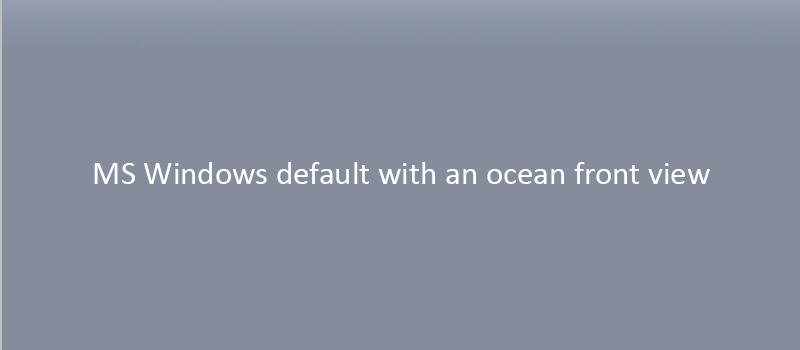
Until 2021, the Microsoft systems default font was Calibri, aka if you’re reading something in Calibri, there’s a 98% chance you’re in a horrible mood. You’re either stuck watching an afternoon-long PowerPoint presentation in a La Quinta Inn conference room or scouring archived Microsoft help articles because you’ve seen the blue screen of death for the third time this week.
Using Calibri on your real estate agency's website shows a need for more effort and consideration for your message. Your words are delivered wrapped in fonts - don't let that font be a default.
2. Comic Sans

Do I need to say anything? The only thing more offensive than Comic Sans is that we live in a world where it’s not even the worst font—also, remember this throwback, Cleveland?
There are whole websites and campaigns surrounding the use or, rather, misuse of comic sans. I hope for a day when it is removed as an option for all web editor drop-down menus, but something just as inappropriate will take its place.
1. Papyrus
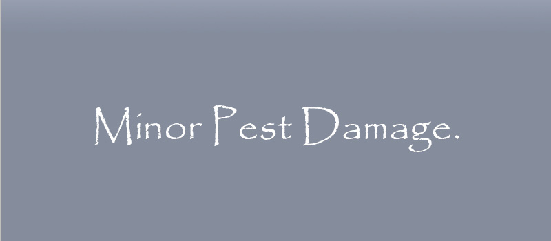
The king of bad fonts. Papyrus is cheap, kitschy, and irritating. Though graphic designers (and SNL writers) have the most visceral response to its use, it certainly has no place in a professional setting, not-to-mention any tribal futuristic movie title.
The font looks like it has termite damage, an association you want nowhere near your property listing or brand. So even if your client's home is made of sand and shaped like a pyramid, avoid it at all costs.
Now, there you have it — the seven worst fonts to use on your real estate company's website. If you've been guilty of using one of these fonts, there is no shame — we've all been there. Let's pray it isn't etched in stone on a billboard for eternity. Remember, your web font choice is an extension of your brand. Using an appropriate font with increase your website optimization and visitor experience.
Feel free to click here if you'd like some advice for your real estate company's website and website optimization. Or, if you're looking for some design advice, reach out. We'd love to hear about your challenges and see if we can help.