Whether you’re walking along North Market Street with its mix of upscale, and casual dining options or admiring the views from the Carroll Creek Promenade, we can all agree that Downtown Frederick, Maryland has a lot to offer.
Not only is it the proud home of Illumine8 Marketing & PR, it also has a selection of unique specialty shops, restaurants, and small businesses that make walking around Downtown truly charming.
Business owners know that a unique storefront is what initially attracts someone from the street to the store. How do you create a unique storefront? By having a unique logo.
Here are the five best logos in Downtown Frederick that draw in visitors and please the eye:
Retro-Metro
If you’re searching for the perfect gift for your quirky friend, a uniquely sublime decoration for your work desk, or that perfect something to tie your living room together, you’ll likely find it at Retro-Metro.
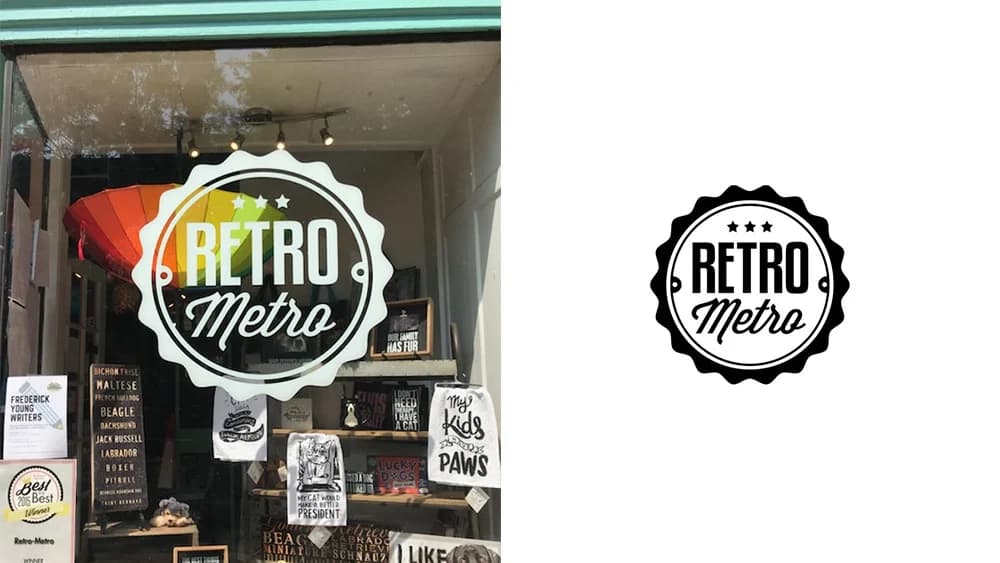
The storefront logo of Retro-Metro was designed by Sherri Audette Johnson, who also happens to be the owner of Retro-Metro. Sherri used her talent to create the logo from previously being the owner and creative director for a design firm in Baltimore called Centigrade Studio.
The logo is creative yet simple, classic, modern and overall super trendy. The pairing of two fonts that complement each other well, inside of a scalloped circle, creates an upbeat and fun vibe that you know you’ll also find in the store.
Using two different yet complementary typefaces is a big trend in the design world. This technique creates a very modernized version of what we think of as “retro” and is timeless.
Olde Mother Brewing
We’re proud to welcome our new neighbors to Downtown Frederick! Olde Mother Brewing opened a new location on Market Street, but the brewery has been crafting wonderful beers in Frederick since 2015.
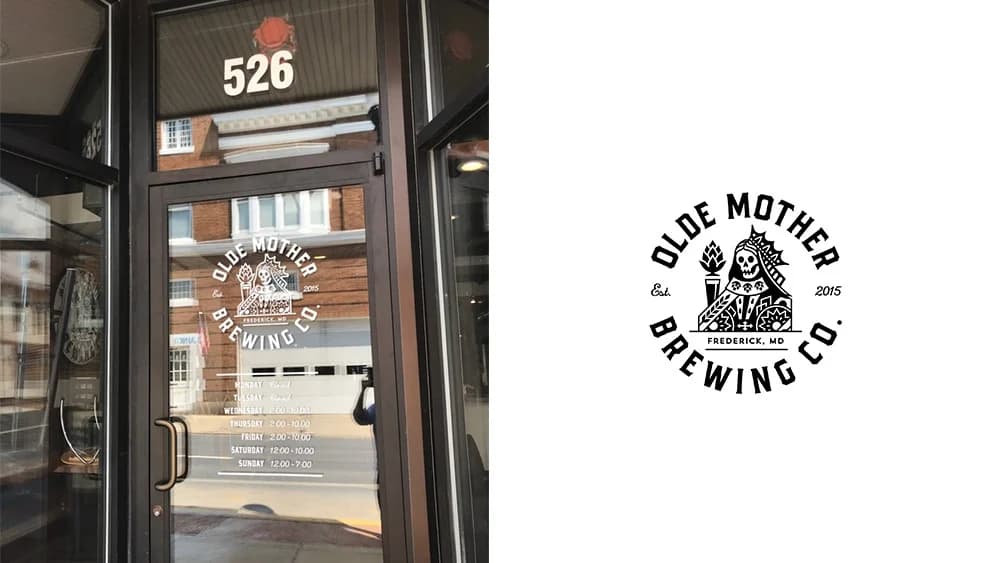
With a new location came a brand-new logo that's eye-catching and intricate. Designed by Ben Kauffman, the logo stands out because of the skeletal queen figure in the center, which resembles a playing card. The name of the store forms a circle around the figure.
Olde Mother Brewing works with Kauffman on other exciting design projects that are said to be coming soon. Several qualities make this logo one of the best. First, it's memorable and unique because a story is told within it.
Second, the logo is timeless. Using white as the initial color ensures that the logo never looks outdated. Lastly, the logo includes the name of the brewery and is very versatile.
North Market Pop Shop
If you’re looking for that old-time nostalgic experience, a sweet treat, or a classic Coca-Cola in a glass bottle, the North Market Pop Shop is the right place for you. They have an incredible selection of glass-bottled craft, retro, and vintage sodas that line the walls. They also serve ice cream, hot dogs, and other goodies to pair with whichever soda you choose.
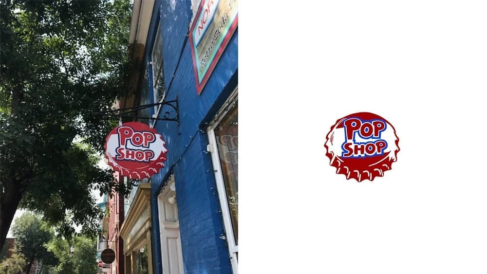
The North Market Pop Shop’s bottle cap logo perfectly captures the aesthetic of the store. It's fun, creative, and looks like it was taken straight out of a pop art comic.
This logo is extremely memorable because of its unique aesthetic and the bright vibrant red used to make the shop’s hanging sign pop in the neutral tones of Downtown Frederick.
Glory Doughnuts & Diner
You just found your new favorite breakfast spot. Glory Doughnuts is well-known in Downtown Frederick for their experimental doughnut flavors with unique designs, as well as their great breakfast selection. Also, everything on their menu is vegan.
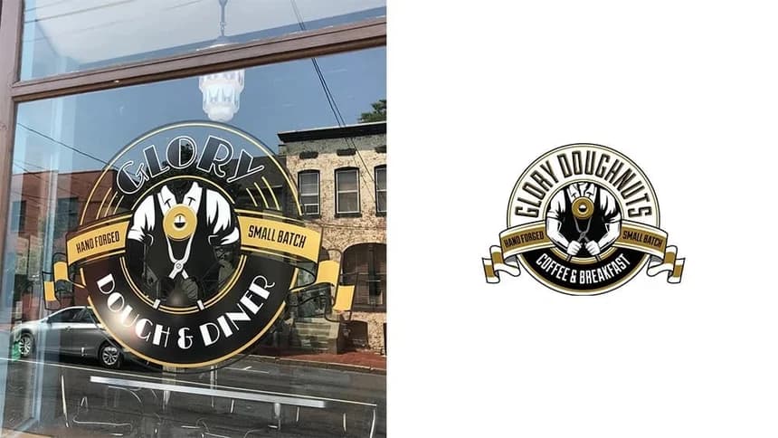
If you look closely enough, the Glory Doughnuts & Diner logo looks like a donut. Logos that take a subtle but literal approach help connect the logo with what the business is and does.
A freelancer named Jeffrey Baker designed the logo. Baker also runs a T-shirt company called Cheap Pop Shop. The gold, white, and black color palette goes perfectly with the Gatsby-like font. The ribbon that cuts through the center creates an organized hierarchy leading your eyes to the word “Glory” first.
In the center, we see a human figure, whose head isn't shown, yet the “O” in glory sits directly above, giving the illusion of a head.
Maven Beauty Bar
Maven Beauty Bar is the place for brows and clean beauty products. They nailed the aesthetic in their store with their online presence and their logo.
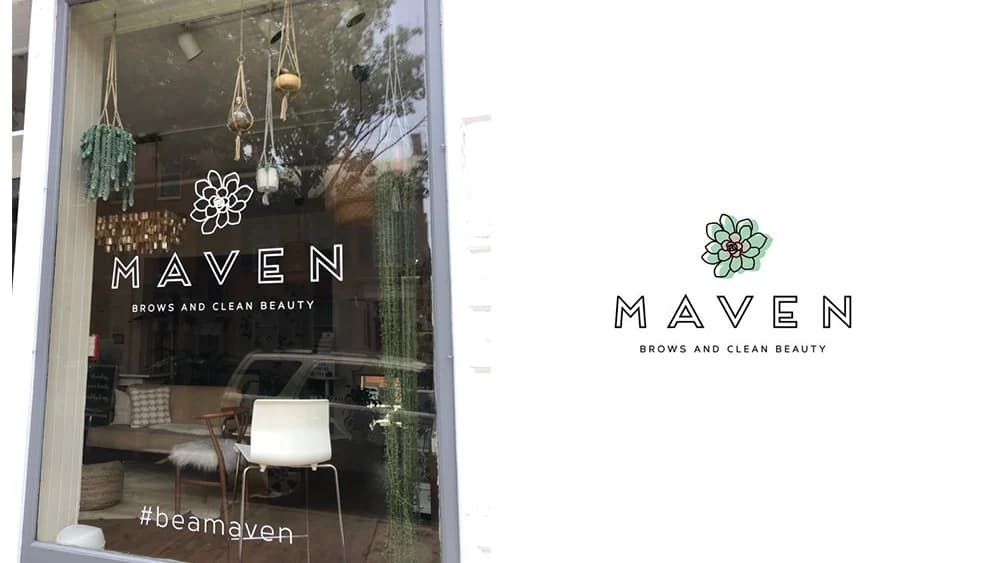
It only makes sense that the business should have a simple and timeless logo. Aurore Maxon designed this minimalistic logo that creates a calm feeling, a vibe that a clean beauty bar definitely wants to have.
The name of the business is also included within the logo, which is always a plus. The flower/succulent shape above the name is very unique, and you can tell isn’t a clip-art image.
The Illumine8 Marketing & PR team is proud to call Frederick, Maryland, home. We’re glad to have neighbors with such great taste in graphic design.
If you’re looking to upgrade or redesign your website, attract more leads, or improve your marketing overall, reach out to us!